

See Exactly Where Your Energy Dollars Go With Interactive R Graphs
Transform raw solar production and energy consumption data into dynamic visual stories that reveal patterns static spreadsheets hide. Interactive graphs in R allow Illinois solar customers to zoom into specific time periods, hover over data points for exact values, and filter between seasons to understand when panels perform best and where energy waste occurs.
Static monthly utility statements show totals, but interactive visualizations expose the complete picture: morning production surges, afternoon consumption peaks, and seasonal variations unique to Illinois weather patterns. R programming language provides free, powerful tools that turn thousands of data points into clickable, explorable dashboards accessible through any web browser.
Solar system owners can identify underperforming panels by comparing individual unit output, spot opportunities to shift high-energy tasks to peak production hours, and quantify actual savings with precision. Business owners gain immediate insights into demand patterns, while homeowners discover exactly how weather events impact their system performance. These visualizations transform abstract numbers into clear action items, whether optimizing energy usage schedules, detecting maintenance needs early, or documenting return on investment for locally owned solar installations across Illinois.
Why Static Energy Reports Leave You Guessing
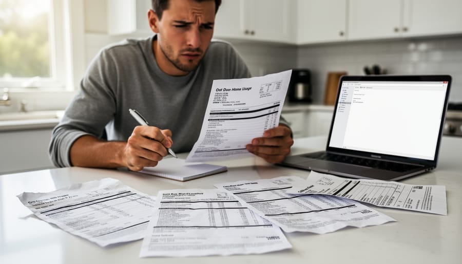
If you’re like most homeowners and business owners in Illinois, your monthly utility bill arrives as a PDF or paper statement showing one important number: your total energy usage and cost. While this tells you what you owe, it leaves critical questions unanswered. When exactly did you use the most electricity? Which days or hours drove your costs higher? How did last summer’s air conditioning compare to this year’s usage?
Traditional static reports present data as fixed snapshots. You might see a bar chart comparing this month to last month, or a year-over-year total, but these simplified visuals can’t reveal the patterns hiding beneath the surface. For businesses trying to reduce operational costs or homeowners who’ve invested in solar panels, this lack of detail becomes frustrating. You know something is affecting your energy consumption, but pinpointing the cause feels like guesswork.
The challenge intensifies when you add solar production to the equation. Your monthly statement might show net energy usage, but understanding how much power your panels actually generated at different times, when you’re drawing from the grid versus using your own solar energy, or how seasonal changes affect production requires deeper analysis. Static reports simply weren’t designed to answer these questions.
Without access to smart energy tracking tools, you’re left making important decisions about energy efficiency upgrades, solar system sizing, or behavioral changes based on incomplete information. This is where interactive data visualization transforms your understanding, turning raw numbers into actionable insights you can explore on your own terms.
What Makes R the Smart Choice for Energy Visualization
When it comes to monitoring your solar energy system’s performance, you need tools that can handle complex data without requiring a computer science degree. R programming has emerged as a surprisingly accessible solution for creating interactive energy dashboards, even if you’ve never written code before.
What makes R particularly valuable for solar energy visualization? First, it’s completely free and open-source, which aligns perfectly with the cost-saving mindset that drives many Illinois homeowners and businesses to choose solar in the first place. Unlike expensive proprietary software, R gives you full control over your data without ongoing subscription fees.
R excels at handling time-series data, which is exactly what your solar panels generate every day. Whether you’re tracking hourly production, daily consumption patterns, or seasonal trends across Illinois’s variable weather conditions, R processes this information naturally and efficiently.
The real advantage comes in flexibility. While your solar installer’s standard dashboard shows basic metrics, R allows you to dig deeper into the questions that matter to your specific situation. You can compare production against local utility rates, identify peak usage times, or analyze how cloud cover affects your system’s output.
Most importantly, R creates web-ready visualizations that you can share with stakeholders, whether that’s your facilities team, board members, or even curious neighbors considering their own solar investment. These interactive graphs transform raw numbers into compelling stories about your energy independence and environmental impact.
Interactive Features That Actually Change Behavior
Zoom and Filter Your Consumption Timeline
One of the most powerful features of interactive energy graphs built with R is the ability to zoom through different time scales. You can start by viewing your entire year’s consumption at a glance, then click to drill down into a specific month that shows unusual patterns. From there, you can zoom further into individual weeks, days, and even hourly breakdowns to pinpoint exactly when energy usage spikes occur.
This granular view helps Illinois homeowners identify which appliances are driving their electricity costs. For instance, you might discover that your air conditioning usage peaks between 2-4 PM on summer weekdays, or that a basement dehumidifier runs continuously overnight. By applying filters to isolate specific circuits or appliance categories, you can see precisely how much each device contributes to your monthly bill.
For business owners, this zooming capability reveals operational patterns that may otherwise go unnoticed. A manufacturing facility might identify equipment that consumes excessive power during idle periods, while a retail store could correlate customer traffic patterns with HVAC costs. These insights transform raw data into actionable decisions, helping you optimize both conventional and solar energy systems for maximum efficiency and cost savings.
Compare Before and After Solar Installation
One of the most powerful applications of interactive graphs is visualizing the transformation in your energy profile after installing solar panels. Instead of simply reading numbers on a utility bill, you can see dynamic overlays that compare your previous grid consumption against your current solar production. These visualizations typically display two distinct data sets on the same timeline: your historical electricity usage from the grid and your new solar generation, allowing you to immediately identify when your system is producing surplus energy or when you’re still drawing from the grid.
Interactive sliders let you move through different time periods, comparing typical summer months before solar installation with current performance during peak production season. This hands-on exploration makes it easy to understand exactly when your solar investment is working hardest for you. Many Illinois homeowners find that hovering over specific dates reveals precise dollar amounts saved, helping them track their return on investment in real-time rather than waiting for annual summaries.
The visual contrast between the before-and-after periods provides compelling evidence of your system’s impact, showing reduction in grid dependence through color-coded graphs where solar generation appears in one shade and remaining grid usage in another. This immediate, visual feedback helps you make informed decisions about energy usage patterns and validates your investment in renewable energy.
Hover for Real-Time Data Points
Interactive graphs shine when they reveal precise information on demand without overwhelming your screen. When you hover your cursor over any point on your energy visualization, a small tooltip appears displaying exact values—the specific kilowatt-hours your solar panels generated at 2:15 PM, the exact cost of electricity during peak hours, or your home’s consumption at any given moment. This approach keeps your dashboard clean and readable while giving you access to detailed data whenever you need it.
For Illinois homeowners monitoring their solar systems, this feature proves invaluable during billing analysis. Instead of squinting at crowded axis labels or guessing values between gridlines, you can pinpoint the exact moment your solar production peaked on a sunny afternoon or identify when your business consumed the most electricity. The tooltip disappears when you move your cursor away, returning the graph to its uncluttered state. This dynamic interaction transforms complex energy data into an accessible tool that helps you understand your consumption patterns, validate your solar investment performance, and make informed decisions about your energy usage throughout Illinois’s varying seasons.
Toggle Between Different Metrics
Interactive graphs built with R allow you to switch seamlessly between different metrics with just a click. Instead of creating separate static reports for energy costs, consumption patterns, solar production levels, and environmental impact like CO2 offset, you can view all these perspectives within a single dynamic dashboard. This toggling capability helps homeowners and business owners understand the complete story behind their solar investment. For example, you might notice that while your consumption peaked on a summer afternoon, your solar production offset both the cost and environmental impact during those same hours. By visualizing cost savings alongside carbon reduction, you gain a fuller appreciation of how your solar system performs financially and environmentally. This comprehensive view empowers you to make informed decisions about energy usage and helps communicate the value of solar to stakeholders, whether that’s your family or your company’s leadership team.
Real Applications for Illinois Solar Customers
Residential Solar Monitoring Dashboards
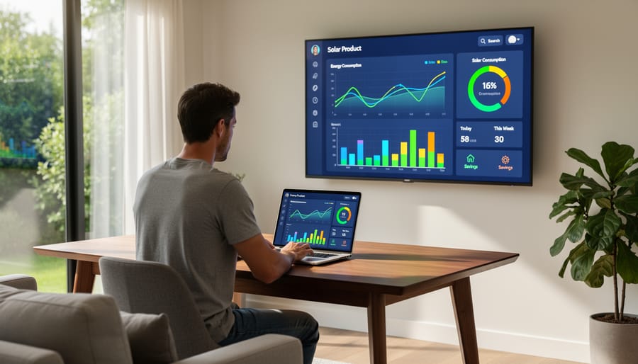
Homeowners with solar installations increasingly rely on interactive dashboards built with R to monitor their systems in real-time. These dashboards display daily solar production alongside household energy consumption, allowing families to see exactly when their panels generate the most power and when their home uses the most electricity.
The interactive nature of these tools lets you zoom into specific time periods, compare weekdays versus weekends, and identify patterns in your energy use. For example, you might discover that running your dishwasher or charging an electric vehicle during peak solar production hours maximizes the value of your self-generated electricity.
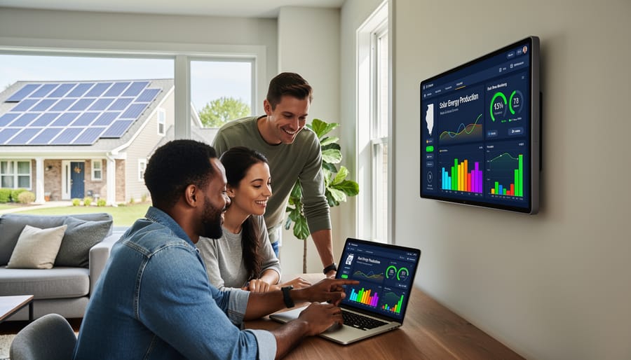
Many Illinois homeowners share these dashboards with family members through web-based platforms, turning energy monitoring into a collaborative effort. When everyone can see how their daily habits affect solar performance, it naturally encourages more energy-conscious behavior. Kids might notice that running multiple devices simultaneously reduces the home’s solar offset, while adults can optimize when to run major appliances.
These monitoring systems also enhance your solar service experience by providing clear data when communicating with your installation company about system performance, maintenance needs, or potential upgrades.
Commercial Energy Management Systems
For businesses managing multiple facilities or tracking energy across different operational periods, R interactive graphs transform how you monitor and communicate energy performance. Multi-location comparisons become straightforward when you can click between different sites or overlay consumption patterns on a single dashboard. This is particularly valuable for Illinois businesses with facilities across different utility territories, where rate structures and solar incentives may vary.
Shift-based usage analysis helps identify exactly when and where energy costs spike. Interactive graphs allow managers to filter data by time of day, production schedules, or seasonal patterns, revealing opportunities to shift high-energy tasks to periods of maximum solar production. For example, a manufacturing facility can visualize whether running equipment during peak sunlight hours would reduce grid dependence.
These visualizations also serve as powerful tools for demonstrating sustainability commitments to stakeholders, customers, and investors. Rather than presenting static charts in annual reports, businesses can share interactive dashboards showing real-time progress toward carbon reduction goals. The ability to zoom into specific timeframes or highlight particular metrics makes your environmental achievements more tangible and credible. For Illinois companies pursuing green certifications or responding to corporate sustainability requirements, interactive energy visualizations provide the transparent, detailed reporting that modern stakeholders expect.
Pre-Installation Analysis Tools
Before installing solar panels, understanding how a system will perform for your specific property is crucial. Interactive graphs built with R allow our locally owned team to create personalized energy models during your consultation. These visualizations combine your historical electricity usage data with projected solar production based on your roof’s characteristics, orientation, and Illinois-specific weather patterns.
Instead of reviewing static charts, you can explore different scenarios in real-time. Adjust panel quantities, examine seasonal variations, or compare financing options while watching the numbers update instantly. This dynamic approach helps you visualize potential savings with greater clarity than traditional proposals allow.
Our expertise in solar energy, combined with R’s analytical capabilities, means we can answer “what if” questions immediately. How would adding battery storage affect your energy independence? What happens during Illinois winters? Interactive pre-installation graphs transform these conversations from abstract concepts into concrete, visual answers tailored to your property and consumption patterns.
Getting Started With Your Energy Visualization
What Data You’ll Need
To create meaningful interactive graphs of your energy usage and solar production, you’ll need access to a few key data sources. Start by obtaining your electricity consumption data from your utility provider. Most Illinois utilities now offer downloadable usage data through online customer portals, typically in CSV or Excel format, showing consumption by hour, day, or month.
Next, you’ll need production data from your solar inverter’s monitoring system. Modern inverters automatically track how much electricity your panels generate, often accessible through manufacturer apps or web dashboards. This data usually includes timestamps and power output measurements that align perfectly with utility data.
The real power of R interactive graphs comes from combining these sources. When you merge consumption and production data, you can visualize net energy usage, identify peak production times, and spot opportunities for optimization. Many homeowners also incorporate weather data or time-of-use rate information to create comprehensive dashboards that reveal patterns impossible to see in standard monthly statements.
Working With Your Solar Provider
Illinois Renewables and similar solar providers increasingly offer integrated monitoring platforms that bring interactive visualization directly to their customers. Most modern solar installations include web-based dashboards or mobile apps that display real-time production data, often built on frameworks like R Shiny or similar technologies. These platforms allow you to track your system’s performance through interactive charts, compare historical trends, and identify potential issues before they impact efficiency.
When selecting a solar provider, ask about their monitoring capabilities and whether they offer customizable visualization options. Illinois Renewables, as a locally owned company with expertise in solar energy, can help Illinois solar customers understand which monitoring tools best suit their needs. Many providers also offer technical support to help you interpret data patterns and optimize your system’s performance.
Beyond standard monitoring, some providers integrate weather data, utility rate information, and predictive analytics into their visualization platforms, giving you comprehensive insights into your energy landscape and return on investment.
Interactive R graphs transform the complex world of energy data into clear, actionable stories that Illinois property owners can understand at a glance. Instead of struggling through spreadsheets filled with confusing numbers, you gain visual insights that reveal exactly how your solar investment performs throughout the seasons, where opportunities exist to reduce costs, and how your system responds to Illinois weather patterns. These dynamic visualizations turn your energy data into a powerful tool for making informed decisions about consumption habits, system optimization, and long-term savings strategies.
As a locally owned solar provider with deep expertise in solar energy, we understand that investing in solar means investing in your financial future. Interactive visualizations help you track your return on investment in real-time, celebrate your environmental impact, and identify opportunities to maximize your system’s performance. When you can see your data come alive through responsive graphs, you’re empowered to take full control of your energy future.
Ready to experience how interactive visualizations can transform your solar consultation? Contact us today to request advanced visualization capabilities as part of your personalized solar assessment, and discover how data-driven insights can guide your journey toward energy independence.
